How To Analyze Open Data With Able2Extract, Power BI And DataHero

There is a general sense of helplessness when it comes to analyzing public data, especially as people think it involves insane amounts of statistical mastery and in-depth knowledge of complicated statistical software.

This is especially nerve wracking for data journalists, who are keen on using data to write stories that can actually influence a certain aspect of our society, such as healthcare or education. Truth be told, analyzing data and storytelling actually go hand in hand.

Since the Open Data initiative started, more and more data sets have seen the light of the day on various data-related portals. The most interesting data sets for journalists are the ones who are publicly available, simply because they are free to use and analyze. Those data sets are available on a variety of online sources, such as: www.data.gov, open.canada.ca, data.gov.uk and many more.

Open data portals contain thousands and thousands of data sets, related to various branches of government: education, business, economy, crime, justice, healthcare and more.

Once you start exploring the online data, you will see that it usually comes in 3 main formats: HTML, XML and PDF.

Common Open Dataset Formats

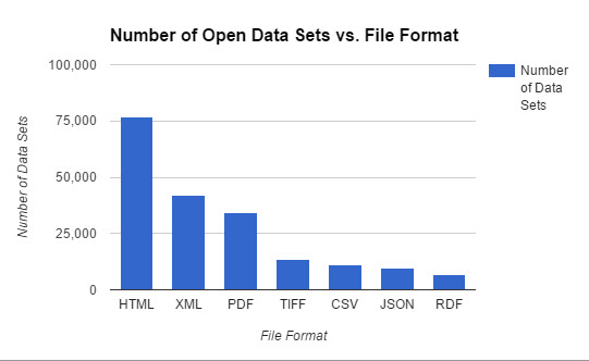
However, if you start investigating the data sets in more depth, you will quickly notice that there is only one format that’s present in almost every data set — the PDF. So, the logic goes that if you know how to analyze data that’s locked inside a PDF, you’ll know how to analyze any.

But what makes people want to store data in a non editable format?

First of all, when you save a data set as a PDF you are reducing its size, so it’s easier to store and upload to online databases. Secondly, since the PDF is not editable by default, you are making sure that no one tampers with your data and changes any of the ever-so-important numerical values. Remember, people spend countless hours gathering data and they are keen on protecting their hard work as much as possible.

So, once you find a PDF data set, where do you go next?

You now basically have only one option — you need to get that data into an Excel or CSV file format, while preserving source document accuracy as much as possible. After you do that, the next step would be to import that converted file into a data visualization tool of your choice, which we will cover later in this tutorial.

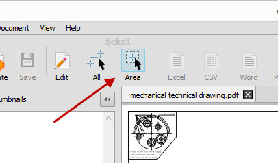
When it comes to exporting PDF data, the only tool in the market that has advanced enough PDF exporting capabilities is Able2Extract. That is because Able2Extract is not just a regular PDF converter. See, most (if not all) PDF converters on the market only convert PDF to Excel automatically, leaving you with a messy data set. The automatic conversion works good for one page invoices but converting a 1,000 page data set takes a lot more than that.

Able2Extract is the only converter that lets you fully customize your conversion by manually setting up row and column structure, prior to conversion. In addition it lets you preview the conversion results from within the software, which lets you export your data set as accurately as possible.

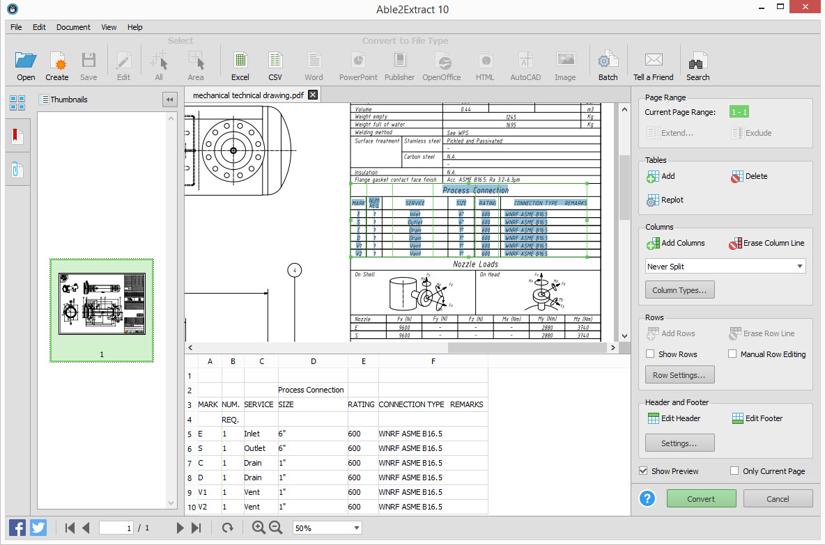
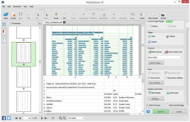
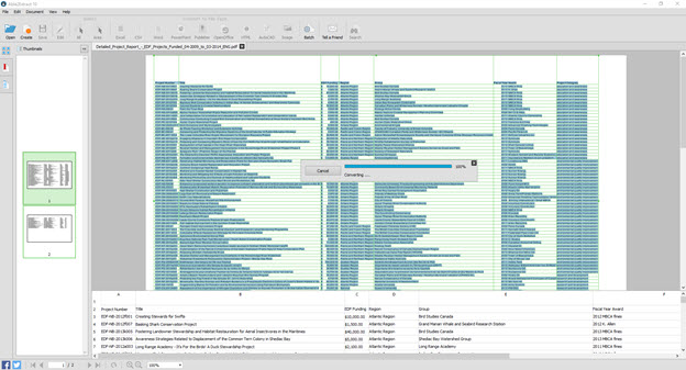
First, find your PDF data set. For this tutorial, we are going to use a practice data set containing all funded projects from Canadian Environmental Damages Fund. You can download it here.

Open the data set in Able2Extract and use custom PDF to Excel conversion to convert it to an Excel file. Set up row and column structure using the right side panel and make sure to check the “Preview conversion” box. Once satisfied, hit the convert button to send the data to Excel.

Able2Extract Custom PDF to Excel

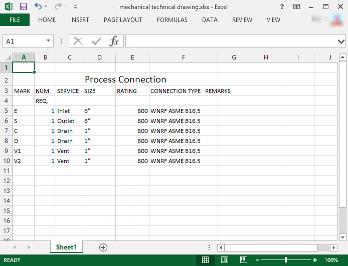
So, we got our data from PDF and into Excel. Great job!  

The next step is to go to Excel and clean the data. This will take 15 minutes to 2 hours, depending on the data set, but the thing you are looking for in the end is to end up with data in the tabular format, which means there is a separate row for each record. It should look something like this:

PDF to Excel Conversion Results

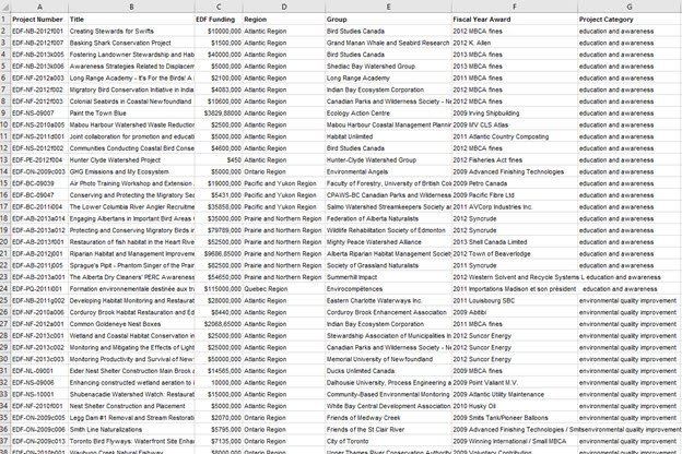
Make sure you don’t have any empty rows or blank cells and that all text is formatted in the same way. If there is a row with 3 cells missing it’s best to delete the whole row because it can mess up your end result and produce inaccurate results.

Now that we have a clean and tidy data set, it’s time to give life to these numbers and visualize them. Enter data visualization.

Data visualization simply means to create interesting charts from just plain data, which makes it easier to understand and present to your readers. When it comes to visualizing data you have an option between a desktop dataviz tool and a cloud dataviz tool. We will explore one example of both.

Our recommended desktop software for visualizing complex data is Power BI. We are recommending it because of its compatibility with Excel and the fact that it’s free to use for datasets up to 1 GB. You can download it here.

Before we start with Power BI, you will need to know that analyzing data starts by asking questions and then using data to answer them. For example, you can ask questions regarding our practice data set before we even upload it to the dataviz tool:

  • What was the EDF funding per region?
  • Which group received the biggest funding?

Depending on the data set, you can ask a 1000 questions and, make no mistake, you will get a 1000 answers. OK, let’s move on to more serious stuff. Power BI.

Power BI

Power BI is a Business Intelligence tool created for monitoring business performance and discovering market opportunities. Today we will use it as a data journalism tool in order to answer the two questions above.

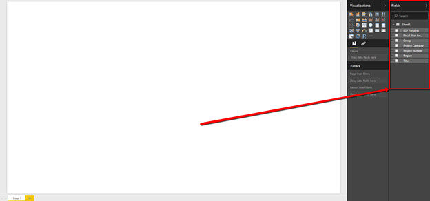
Once you open Power BI you first click on Get Data > Excel > Connect > Your file.

Choose a sheet where data is located and press Load. Alternatively, you can press Edit if you’d like to check your data set for mistakes once again.

Once you do so, you will find a blank canvas and your data values on the right sidebar panel.

Accessing PowerBI Side Panel

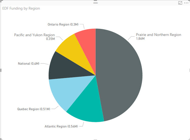
These are the values we are going to slice and dice. Let’s try to answer our first question. If you remember, we wanted to know what was the EDF funding per region.

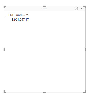
The basic data field there is EDF Funding so we’ll drag it into the “Values” box. The canvas immediately changes and it is now showing us the total EDF funding:

PowerBI EDF Funding Values

Let’s now introduce another data field. Select the “Pie chart”.

PowerBI Data Visualization Selection

Drag the “Region” field into the “Legend” box. Congrats, you made your first data visualization! We now have an overview of the funding per region and we can already start answering some questions.

EDF Funding Visualization By Region

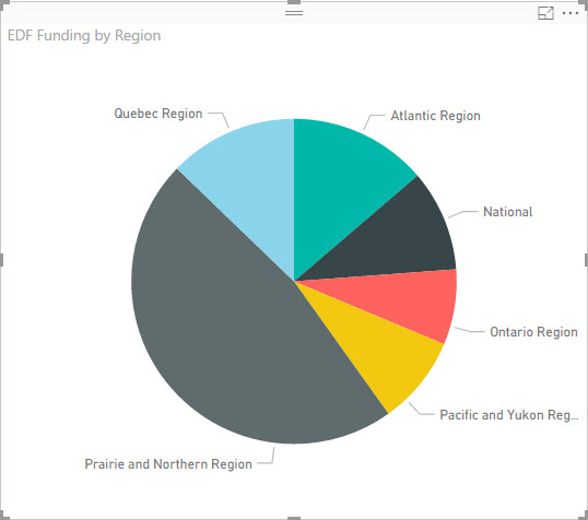
However, if you pay close attention you can see that we still don’t know the exact funding for each region. To show the exact values of data fields, go to “Format” panel:

Accessing PowerBI Fromat Panel

Expand the “Detail Labels” category, find the Label Style and select “Both” from the drop down menu.

Selecting PowerBI Detail Labels

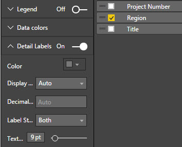
Our pie chart is now showing us the specific monetary values for each segment. Great, first question answered.

EDF Funding Pie Chart

OK, next up is to see which Group received the biggest funding. We’ll repeat the process but we’ll use a different chart, just to demonstrate different features of Power BI.

First, find and click on the Clustered Bar Chart.

Selecting Clustered Bar Chart

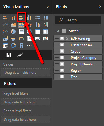
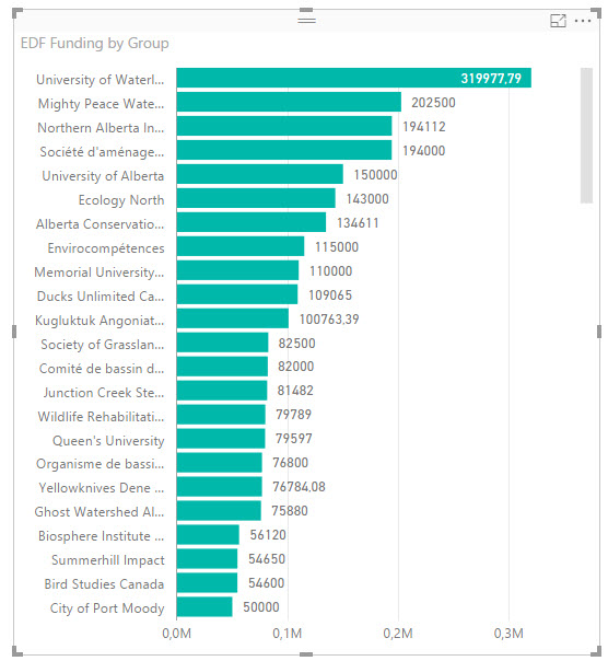
Drag the EDF Funding into the Values box and drag the Group into the Axis box. Turn on the data labels and you’ll quickly see that the University of Waterloo received the biggest funding — almost $320,000

EDF Group Values Chart

Now that you know how to ask questions and visualize public data, we will now quickly go over another tool that can help you visualize your data in the Cloud. Have in mind that the Cloud tools only support lower file sizes, which means you’re best off using them for 10-20 page data sets. Luckily, the data set from our example is actually pretty small.

DataHero

DataHero is a cloud solution for Business Intelligence and data visualization. It allows you to connect files from numerous online and offline sources and it even has an integrated data cleaning tool, which is nice, but I do not recommend relying solely on it.

You can use DataHero for free, for files up to 2 MB in size. Anything larger than that, and you’ll probably have to pay a monthly subscription which is between $60 and $90. For this purpose, we are going to use a free plan.

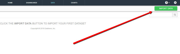
Create an account, click on the Data tab and click on Import Data.

Importing Data With DataHero

Find your Excel file, select the sheet and upload it:

Uploading Data with Datahero

On the next screen, check formatting and proceed.

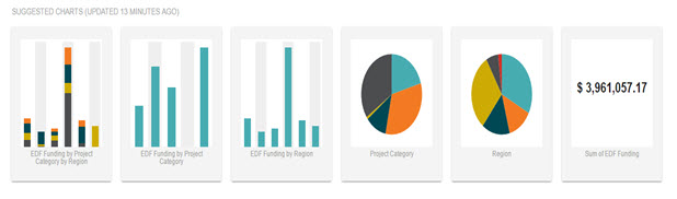
What’s cool about DataHero is that it automatically suggests data visualizations:

Suggested Visualizations From DataHero

I was originally interested in EDF Funding by project category so I’ll just create a brand new chart. DataHero uses the same drag & drop interface so it’s really easy to start using it.

First, drag the EDF Funding field onto the canvas.

PowerBI EDF Funding Values

Next, drag & drop the Project Category field.

DataHero Pie Chart Visualization

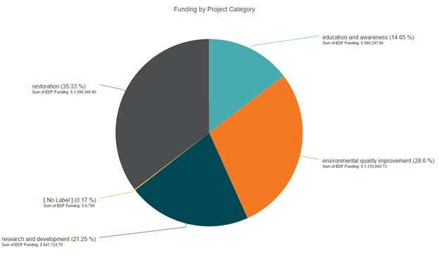
As you can see, we received our answer. Most of the funding money (35%) went into Restoration projects and the rest  was dispersed equally between other three categories.

There are other, more complex, data visualization tools but we will stick with DataHero and Power BI for the time being as they offer the most features in their free plans.

Let’s recap the entire process of analyzing public data that’s archived in PDF:

  1. Find a relevant data set
  2. Use Able2Extract’s Custom PDF to Excel feature  to convert it to Excel or CSV
  3. Clean the data in Excel and remove blank rows and cells
  4. Visualize the data using a tool like Power BI or DataHero

By now you should have a clear understanding of the entire process of analyzing public data and should be well on your way to using it to shape the future of journalism. The strategy is simple — just upload clean, high quality data and play around with it until you get what you are looking for.

How To Export A Table From PDF AutoCAD Drawing Into Excel?

Part 2 of 13 in our How To Use AutoCAD series

Working with PDF documents is difficult. Just working with the data itself can be time consuming. This is especially true when you need to extract something as precise as a PDF table into Excel. It requires that data to be transferred, cell by cell correctly into a spreadsheet, formatted perfectly and faithfully to the original.

So you can imagine how exporting a table from a PDF drawing to Excel is somewhat more complicated than exporting a table straight from AutoCAD to Excel.

However, this can be easily accomplished with Able2Extract’s “Custom PDF to Excel” conversion feature.

You can download the 7 day free trial and follow the steps below to export your table.

1.Open your PDF drawing with Able2Extract.

2. In the select panel, click on “Area”. Left click and drag to mark the table that you would like to export.

Selecting PDF Drawing Content

3. Once selected, click on “Excel”.

4. You’ll be presented with a Convert to Excel panel. Export simple tables automatically by clicking “Convert”. For now, stick to the Custom conversion and hit “Define”.

PDF Drawing Table Conversion

5. Now you have a complete control over your PDF to Excel conversion. Use the toolbar on the right to add and remove output columns and rows. When satisfied, check the “Show Preview” box to review your results.

6. Click “Convert” and save the file.

PDF To Excel Results

Converting AutoCAD tables to Excel may sound like a complicated procedure at first, but with the right tool, you can easily maneuver around that obstacle and work with any AutoCAD tables you come across.

Get Ready For March Madness With Able2Extract 10

Basketball Slam Dunk

Microsoft Excel can be intimidating. True.  But a big pro is that it can be a life saver when wrestling with numbers and data.

Now, if you’re asking yourself when in the world would you have to deal with numbers and data, we have two words for you: March Madness.

March Madness 2016 is almost here and you can bet that everyone who doesn’t (or does) deal with data will be wading in conference standings and school stats over the next few weeks.

If you’re running a March Madness pool for your office, using MS Excel will be the best way to analyze, track and digest all the information you need to fill out your brackets and keep your pool in order.

Yet that’s only half the battle. The other half is getting that data into Excel. And this is where Able2Extact 10 can help you get everything in order.

Transfer Any March Madness Data To Excel

In Excel, you can streamline and combine any existing data you want to keep as reference or update as the tournament goes on.

Player and team data will usually be available in a downloadable PDF. But what if you have a Word file? A PowerPoint presentation? No worries.

You can get your March Madness data into Excel spreadsheets regardless of the format you have. Just open your file in Able2Extract 10 and select the content you want converted (a page, line or the entire file). Then simply click on the Convert to Excel command on toolbar.

Easily Convert Complex Team Information With A Few Settings

There are a lot of pain points associated with dealing with data when managing a pool—or several, one of them being the many different formats you have to consolidate and analyze. If you have differently formatted tables or statistical charts spanning pages, it can be a nightmare.

Good news is that you can tailor a PDF to Excel conversion according to the table structures in your file. Able2Extract has a few PDF to Excel conversion settings that make the job easier to identify and deal with the source document’s table structure. Select your settings before you make the conversion and you’re good to go.

Able2Extract Excel Conversion Settings

Customize Your Data Extractions Into Excel

You may also need specific data extractions for analyzing detailed statistics. For example, you may want to eliminate the data for lower seeded teams or scrape only the data from top teams in the last year to create your own shortlist.

For this, you can simply perform a Custom PDF to Excel conversion and filter out that information even before you even hit the Convert button. You can move rows, columns and even preview your conversion results to see if you have all the numbers you need in the right place.

Able2Extract Custom Conversion Interface

Convert March Madness Statistics In PDF to CSV

Which team you root for depends just as much on the numbers as it does on a team’s dynamics. But we’re talking about 68 Division I college teams plus stats on individual players, coaches and so on. That’s a lot of data!

It, thus, may be worthwhile to have database tools for March Madness. Or, if you’re tech savvy enough, you may have a tool or script that can crunch the numbers to predict the perfect March Madness bracket.

Able2Extract-CSV-Conversion-Option

In either case, you can get your March Madness PDF data into raw .CSV or delimited formats.  Just click on the Convert to CSV command in Able2Extract. It’ll get your data working with the databases and tools you already have in place.

Organize Your Data According To Worksheets

In some instances, you may have PDF data on teams all lumped into one single PDF with each team on one page or separate categories of data on each page.

It’s convenient for distributing and consuming the information, but hardly so if you want to separate that data. For instance, if you end up wanting to analyze each of the Final Four teams separately, you may want to organize and record each team’s information into separate worksheets.

Excel Single Worksheet Option

Now, you can go into your spreadsheet and move all your data around via copy-paste. But an easier way is to uncheck the Single Worksheet option in Able2Extract’s Excel/CSV Conversion Options before you make your conversion.

This will automatically convert each PDF page into a separate worksheet, saving you the hassle of doing it manually.

No matter what type of pool your group decides to set up, knowing your stats is essential. Whether it be analyzing wins, losses and odds or keeping track of results and pool entries, Excel will be your best bet. The key is getting that data set up properly for analysis. Hopefully a few of the tips above helped!

So with March Madness just around the corner, how are you filling out your brackets this year?

How to Export Tables From AutoCAD to Excel Format?

Part 1 of 13 in our How To Use AutoCAD series

When working with AutoCAD, you never work completely in isolation. AutoCAD workflows are always about collaboration, review and approval. As such, AutoCAD projects and designs will always be connected and work in conjunction with other formats.

More often than not, the detailed tables of information of a design will need to be either recorded, edited or entered into Excel spreadsheets. That being said, you’ll need to know how to get that table into Excel.

To export a table from AutoCAD and edit it in Microsoft Excel simply select the table, then right click and choose “Export”. The table will be exported in .CSV file format.

Next, right click on the exported .CSV file and from the options menu choose Open with Excel.

Opening CSV In Excel

Once the table has been opened in the Microsoft Excel, save it as an .xlsx file and you can instantly start editing the spreadsheet.

Document Storage And Data Extraction Needs For Accountants

In the world of accounting, document handling and management are important. Everything is now highly digitized and it’s now necessary for accounting firms to adjust to an ever growing world of digital data.

To do so, there are many best practices and standards that all accounting firms are encouraged to follow for dealing with document and financial data.

Successful Document Storage Options For Accounting Firms

Major accounting resource sites like AccountingToday.com, for example, emphasizes the importance for document management in the accounting industry by outlining factors for one important area: document storage.

In addition to security and liability among other factors, they place emphasis on file type, and in particular, the PDF format for archival purposes, on their list of factors for successful document storage.

Floppy Disk Saved Files

And this is a great point that needs to be highlighted. As a PDF solutions company, we know the format’s excellent and effective capabilities for archiving. Whether clients decide to password protect the file or selectively lock down what users can do with the content, your clients’ financial data is faithfully and securely available to only you and your intended recipients.  

The Double Edged Sword: Archiving And Data Extraction

However, this also sheds light on one important point about the PDF format. The data that is accurately preserved can also be extracted just as faithfully. This is the PDF format’s main strength for accountants. 

Accountants will often find that PDF documents are not only used at the starting and end points of the process, but also at points in the workflow that come in between–during  the data analysis step.  But as you can imagine, this part of the process, which deals with data that’s already in archival format, can be the number one cause for backlogs in the workflow.

And accounting companies are highly aware of this. The accountants at JMPA (Jewell Muller Professional Accountants), who specialize in tax and accounting services in South Africa, for instance, struggled with the issue themselves.

PDF Bank Statements Need Editing

JMPA provides accounting solutions to small businesses. Being a technology dependent company, they rely on software tools to get their work done. However, they need to work with and edit the data stored in archival PDFs first.

CEO JMPA

“Almost all our documents are PDF bank statements that need to be imported to our accounting software,” explains JMPA CEO Cassie Muller. “Before we can do that, we have to edit them in Excel, which is where we had our first obstacle.”

Their search for a PDF converter solution led them to Able2Extract, which helped them speed up the management of PDF documents.

In our case study with JMPA, we took a close look at how data extraction played a factor in their document management process and what it meant for the company overall. JMPA highlighted some of the benefits of using Able2Extract:

  • Reduced processing time by 85%
  • Saved 80% of money on wages
  • Improved delivery time to clients by 90%
  • Converted 7 months’ worth of bank statements in minutes

In sum, knowing how your accounting company works with all kinds of documents is one of the keys to success. Because being efficient with your document process has an effect on the rest of your firm’s efficiency, be sure to explore all of your software options for storing and extracting document data. With JMPA, they were able to resolve the one factor holding them back with a single PDF converter tool.

Read the full JMPA case study and learn how they managed to improve their document management system in detail .