


It’s an obvious, well-known fact that data and business go hand in hand. You can’t manage one without affecting the other. And whether you’re analyzing a client’s data or using your company’s data to make executive decisions, your tools have to be able to handle the tasks you perform with that information.
For instance, if you’re a data analyst, most of the time you go through these stages of data analysis:
- Data Cleaning: Transform and rearrange the data in a way suitable for data analysis
- Data Analysis: Perform the necessary calculations to extract useful information
- Data Visualization: Use graphs or other type of visualization technique to show your results
While these may be impossible to handle manually, they’re perfectly manageable with Microsoft Excel. The application is advanced yet user friendly enough for the average user.
However, the tricky part you probably struggle with is knowing how to access and apply the right functionalities to your data. Well, it’s time to stop the struggle.
In this post, I’ll show you some Excel tips you can use at each of the data analysis stages. Click through to jump to a specific section or tip.
Tips for Data Cleaning
With each of the tips for data cleaning, you’ll learn how to use a native Excel feature and how to accomplish the same goal with Power Query. Power Query is a built-in feature in Excel 2016 and an Add-in for Excel 2010/2013. This Add-in helps you to extract, transform, and load your data with just a few clicks.
Note: Within Excel 2016, the Power Query features can be found in the Get & Transform group of the Data tab. Use this link to get more information about Power Query or to download it.
For the following tips, I’ll assume that you already have the data within Power Query.
1) Change Format Of Numbers Trom Text To Numeric
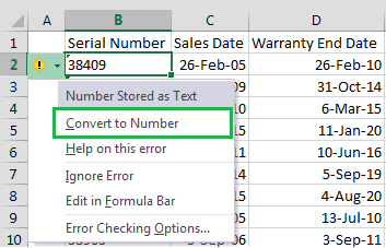
Sometimes when you import data from an external source other than Excel, numbers are imported as text. If this is the case, Excel will alert you by showing a green tooltip in the top-left corner of the cell. If you click the tooltip you’ll see the following message:
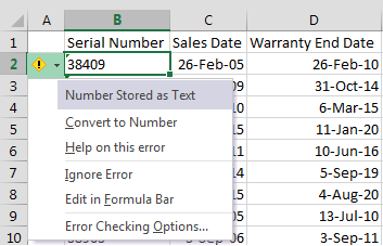
Depending on your computer and the number of values in the range, you can quickly convert the values to numbers by clicking on ‘Convert to number’ within the tooltip options.
However, if there are more than 1000 values, you’ll need to wait a couple of seconds while Excel finishes the conversion.
A faster way of converting the values to number format is to use Text-to-Columns:
- Select the range with the values to be converted.
- Go to Data > Text to Columns.
- Select Delimited and click Next.
- Uncheck all the checkboxes for delimiters (see below) and click Next.
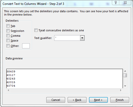
5. Then select General and click on Finish.
When you have lots of numbers to convert this tip will be much faster than waiting for all the numbers to be converted.
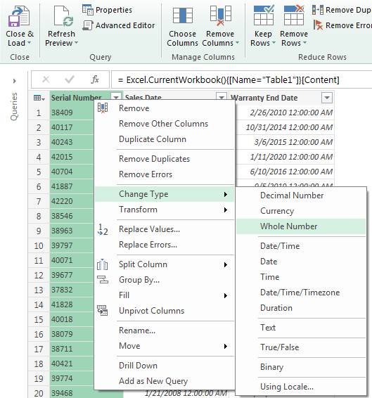
In Power Query this is even easier, just:
- Right click on the column header of the column you want to convert.
- Go to Change Type.
- Then select the type of number you want (Decimal, Whole Number, …).
2) Unpivot Columns In A Data Set (Multiple Consolidation Ranges And Power Query)
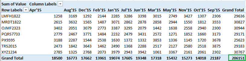
If you’re going to create a PivotTable or use any statistical package, it’s strongly recommended to have each variable on a single column. For example, if you’re creating a PivotTable of shipments you need to have all the shipment values in the same column. Unfortunately, you won’t always receive the data in that tidy format.
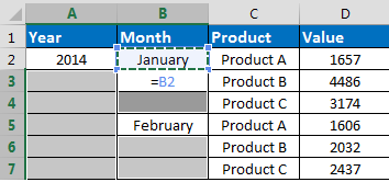
Let’s say you receive the following data set:
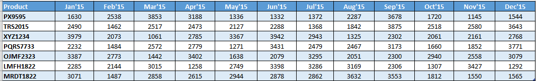
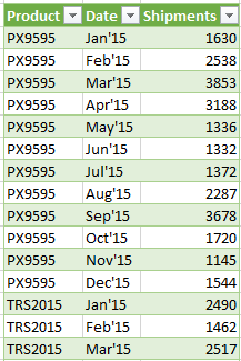
Even though it looks visually appealing it isn’t very useful for PivotTables and other type of features. The best format for data analysis would be as follows:
You can accomplish this using multiple consolidation ranges in Excel or using Power Query.
a) Unpivot columns using multiple consolidation ranges (this is the large and cumbersome way
-Press Alt + D + P (this will open the legacy PivotTable dialog box, see below)
-Select ‘Multiple consolidation ranges’ and click Next.
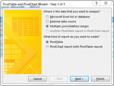
– In the next step, select ‘I will create the page fields’ and click Next.
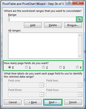
– Click on the range selection button ![]() to select the range that contains the data. Click on ‘0’ page fields and click on Next:
to select the range that contains the data. Click on ‘0’ page fields and click on Next:
A PivotTable will be created with the same structure of the original data source. To unpivot the data just double click on the grand total cell of the PivotTable (bottom-right corner):
Afterwards, the data set will be showed in a tidy format on a new worksheet:
You might want to add proper column names to the table, since the default names are: Row, Column, and Value.
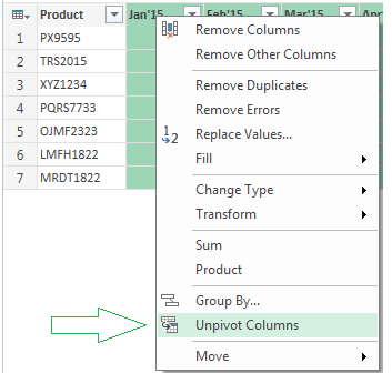
b) Unpivot columns using Power Query (this is the quick and easy way)
– Select the columns you want to unpivot.
– Right click and select Unpivot Columns.
Notice that if you have several columns that won’t be “unpivoted”, using Multiple consolidation ranges will require additional steps. However, with Power Query you just need to follow exactly the same steps explained here.
3) Merge Data From Several CSV Files Into A Single Folder (RDBMerge Add-in And Power Query)
Sometimes the data is stored in several csv (Comma Separated Value) files that need to be imported and merged into a single worksheet.
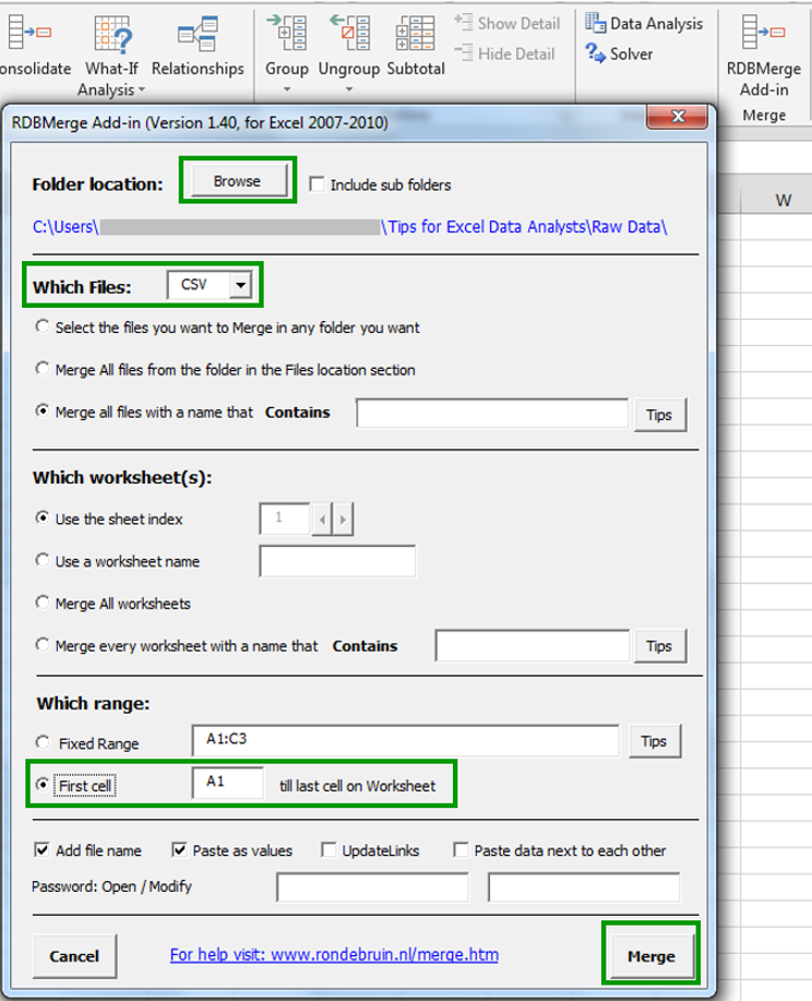
One possible way of doing this is by using RDBMerge (a free Excel Add-in) created by Ron de Bruin. This Add-in can be downloaded for free from Ron’s website where you can also find steps to install the Add-in.
Once you’ve installed the Add-in, follow these steps to use it for importing and merging csv files:
- Go to Data and click on ‘RDBMerge Add-in’.
- Within the dialog box, click on Browse.
- Browse to the folder and press OK. The path to the folder will appear in the top part.
- Select CSV from the Which files dropdown list.
- Select cells range you want to extract. To import the whole file, select First cell.
- Click on Merge.
To do this in Power Query, follow these steps:
1. Within the Power Query menu go to the ‘Get External Data’ group select ‘From File’ and then ‘From Folder’.
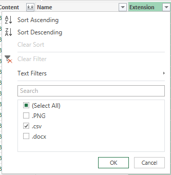
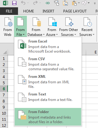 2. Click on ‘Browse’ and browse for the folder that contains the files you want to import. Click Ok. If there are other files within the folder that are not CSV, go the columns ‘Extension’ and select “.csv”.
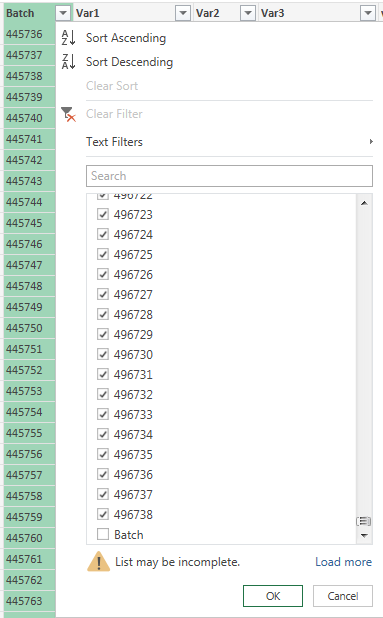
3. Click on the double down arrow button in the Content column. All the csv files will be appended together.
![]()
If the files have header rows, you can exclude them from the data using the filters. In this particular example, the header row contains the word “Batch” in the first row of each file. The header rows can be excluded by unselecting the word “Batch” from the filter.
4) Fill Empty Spaces From Content Above (Ctrl + Enter Trick And Power Query)
If you’re a data analyst, I bet you’ve received a data set with the following format at least once:
Yes, the dreaded empty spaces…
These empty spaces cause a lot of problems when using PivotTables or lookup functions. Therefore, to use this data set you need to complete the empty spaces with the content above.
There are three ways of doing this:
- Fill down the content by dragging with the mouse or doing copy/paste (the never-ending way). Select each item and drag it to complete the empty spaces or do copy/paste into the empty spaces
- Fill down with ‘Go To > Special’ (The fast but complex way):
a) Select the range with the empty spaces (You can select the whole columns if it is easier).
b) Press Ctrl + G (This will show the “Go – to dialog box”) and click on Special.
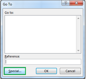
c) Click on “Blanks” and press OK.
d) Type “=” and select the cell just above the active cell.
e) Press Ctrl + Enter.
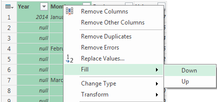
3. Fill down with Power Query (the extremely fast and easy way):
a) Within Power Query select the columns where you want to fill the empty spaces.
b) Right-click on the header of any of them.
c) Go to Fill > Down.
As you can see, Power Query makes the data cleaning process extremely easy. Best of all, once you perform the cleaning steps, Power Query will store them and you can repeat them whenever you want for other data sets.
Tips for Data Analysis
Now that you know some data cleaning tips, let’s see some data analysis tips.
5) Create Auto Expandable Ranges With Excel Tables (Source For Pivots, Dropdown Lists And Formulas)
One of the most underused features of MS Excel are Excel Tables. Excel Tables have wonderful properties that allow you to work more efficiently. Some of these features are include:
- Formula Auto Fill: Once you enter a formula in a table it will be automatically be copied to the rest of the table.
- Auto Expansion: New items typed below or at the right of the table become part of the table.
- Visible headers: Regardless of your position within the table, your headers will always be visible.
- Automatic Total Row: To calculate the total of a row, you just have to select the desired formula.
In this tip, we’ll take advantage of the auto expansion feature when using an Excel Table as a source for a PivotTable, dropdown list, VLOOKUP, etc…
To create a table just select the range you want to include in the table and press Ctrl + T. After you press Ctrl + T, the selected range will change to a format similar to the one shown below:
- Use your Excel Table in PivotTables
If you use a Table as the source for a PivotTable, all information included below and at the right of the Excel Table will automatically become part of the data source of the PivotTable. To display the new information in the PivotTable, just right-click any cell inside the PivotTable and click on Refresh.
- Use your Excel Table as part of a dropdown list
Dropdown lists are a type of data validation within Excel that allows you to select items from a list in a cell (see below):
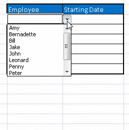 Read this article for details on how to create dropdown lists and how to use tables as a source for them.
When you use Excel Tables as the source of dropdown list the items you add to the table will be part of the dropdown list immediately.
- Use Excel Tables as part of a formula
Like in dropdown lists, if you have a formula that depends on a Table, when you add new items to the Table, the reference in the formula will be automatically updated.
- Use Excel Tables as a source for a chart
Charts will be updated automatically as well if you use an Excel Table as a source. As you can see, Excel Tables allow you to create data sources that don’t have to be updated when new data is included.
6) How To Do Two Way Look Up With INDEX And MATCH
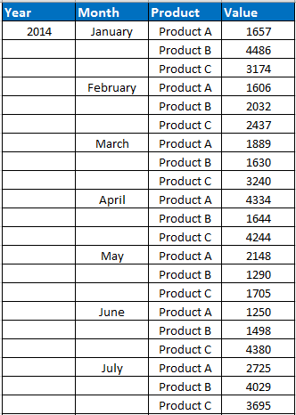
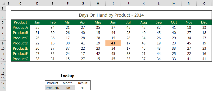
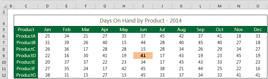
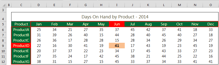
Let’s say you have a table like the one below and you want to do a look up both by Product and Month:
The first function you need to know is INDEX. INDEX will return the value from a range (row, column, or table) corresponding to a position.
Examples:
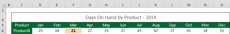
The formula =INDEX(D6:O6, 3) will return the value from cell F6, because F6 is in the third position of the range that contains the cells D6, E6, F6, G6, …
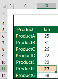
The formula =INDEX(D6:D12, 6) will return the value from cell D11, because D11 is in the sixth position of the range that contains the cells D6, D7, D8, D9, D10, D11, D12.
If you want to get the value corresponding to “ProductD” and “Jun”, the formula is:
=INDEX(D6:O12, 5, 6) because the value corresponding to “ProductD” on “Jun” is on the 5th row and 6th column of the range D6:O12.
You might be thinking “This seems pretty interesting but I should not have to be plugging in the position of the row/column in order to get the right results” and you’re totally right!
That’s the purpose of the MATCH function. The MATCH function will return the relative position of a value within a row or column.
The syntax of MATCH is as follows:
=MATCH(value_you’re_looking_for, row_or_colum_where_you’re_looking_for_the_value, search_type)
There are three types of search in MATCH, however, I’ll focus on an exact search since this is the type used 99.9% of the time. To use exact match, enter a zero (0) in the last argument of MATCH.
Let’s look at a few examples:
If the values “ProductA”, “ProductB”, …, “ProductE” are in the range C6:C12 and you use the formula:
=MATCH(“ProductD”, C6:C12, 0)
you will get a 5 because “ProductD” is on the 5th position of the range C6:C12.
In the same way, if the months of the year are in the range D5:O5 and you use the formula:
=MATCH(“Jun”, D5:O5, 0)
you will get a 6 because “Jun” is on the 6th position of the range D5:O5.
Let’s put together INDEX and MATCH:
Rather than manually plugging in the positions for the product and the month as in:
=INDEX(D6:O12, 5, 6)
you will insert the corresponding MATCH formulas to return the positions for you. Therefore, the final formula is:
=INDEX(D6:O12, MATCH(“ProductD”, C6:C12, 0), MATCH(“Jun”, D5:O5, 0))
Even better, you can point to a cell reference rather than manually typing the product and month. If the product you’re looking for is in cell E16 and the month is on cell F16, you can use the following formula:
![]()
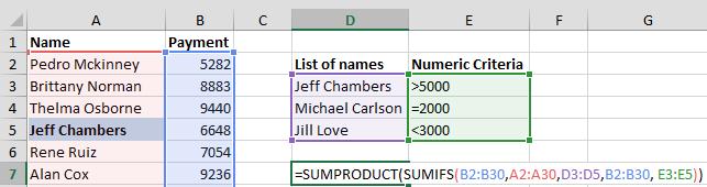
7) Creating OR Criteria Within SUMIF/COUNTIF (Combination Of SUMPRODUCT And SUMIF/COUNTIF)
If you work with SUMIF(S)/COUNTIF(S), you know that SUMIFS/COUNTIFS allow to sum/count items based on AND criteria.
For example, if you use the following formula:
=SUMIFS(B1:B50, A1:A50, “Bob Williams”, B1:B50, “>5000”)
you will sum all the values in the range B1:B50 that are greater than 5000 AND whose corresponding value name in column A is “Bob Williams”.
But, what if you want to sum the values in column B1:B50 for a list of names?
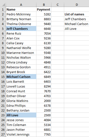
This would be an OR criteria since you want the values for “Jeff Chambers” OR “Michael Carlson” OR “Jill Love”
The first thing that might come to your mind would be to write multiple SUMIFs and add them together. For example:
=SUMIF(A2:A51, “Jeff Chambers”, B2:B51) + SUMIF(A2:A51, “Michael Carlson”, B2:B51) + SUMIF(A2:A51, “Jill Love”, B2:B51)
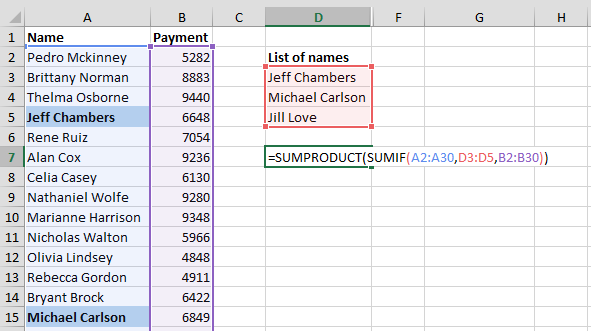
Luckily, there’s an easier way of doing this (with just two steps):
1. Place the range with the list of names in the criteria argument of the SUMIF.
2. Wrap the SUMIF with the SUMPRODUCT function
Let’s look at a more interesting scenario. You want to sum the values meet the following conditions:
(Are from “Jeff Chambers” AND are >5000) OR
(are from “Michael Carlson” AND are =2000) OR
(are from “Jill Love” AND are <3500).
This is very easy as well, just use SUMIFS and SUMPRODUCT together:
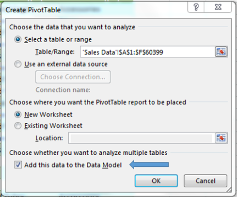
8) Counting Unique Items Within PivotTables (Using The Excel Data Model)
It’s extremely easy to count unique items in a table using the Excel Data Model. The Excel Data Model is an approach for building relational data sources in Excel. This is applicable for Excel 2013 or later.
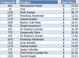
Let’s say I want to count the number of unique products for each product category in the following data set:
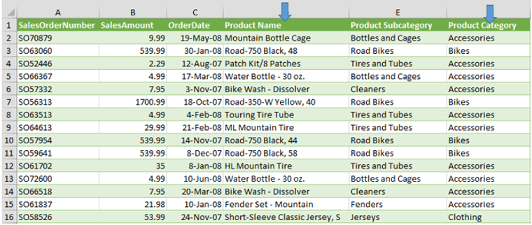
In other words, for each category I want to count each product only once regarding how many times they have been bought.
These are the steps in Excel 2013 or later:
1. Open the PivotTable dialog box (Go to Insert -> PivotTable), select the data source and check on “Add this to the data model”.
 2. Insert all the desired fields for the PivotTable (Row fields, Columns fields, and values fields).
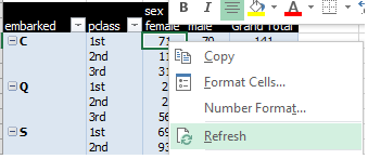
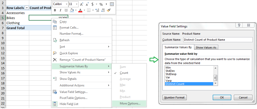
3. Change the summary function for the field you want to count to “Distinct Count”:
a) Right-click on any value of that field.
b) Go to “Summarize Values by” > More Options > “Distinct Count”.
Tips For Data Visualization
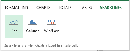
9) Quickly Visualize Trends With Sparklines
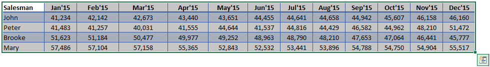
Sparklines are a visualization feature of MS Excel that allow you to quickly visualize the overall trend of a set of values. Sparklines are mini-graphs located inside of cells.
Let’s say you want to visualize the overall trend of monthly sales by a group of salesmen. See the data below:
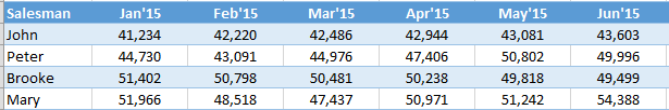
As you can see is kind of difficult to determine what’s going on (who’s selling steady, who has an increasing trend, who’s more volatile,…) just by looking at the numbers. An easy way of quickly teasing out the information is by using Sparklines, as shown below.
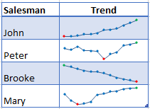 Looks great, right?
To create the sparklines, follow these steps:
1. Select the range that contains the data that you’ll plot (This step is recommended but not required, you can select the data range later).
2. Go to Insert > Sparklines > Select the type of sparkline you want (Line, Column, or Win/Loss). For this specific example I’ll choose Lines.
 3. Click on the range selection button
 ![]() to browse for the location of the sparklines, press Enter and click OK.
to browse for the location of the sparklines, press Enter and click OK.
Make sure you select a location that is proportional to the data source. For example, if the data source range contains 6 rows then the location of the sparkline must contain 6 rows. And that’s all!
If you want to format the sparkline you can do so by following these steps:
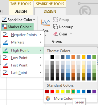
To change the color of markers:
1. Click on any cell within the sparkline to show the Sparkline Tools menu.
2. In the Sparkline tools menu, go to Marker Color and change the color for the specific markers you want.
a) Example: High points on green, Low points on red, and the remaining in blue.
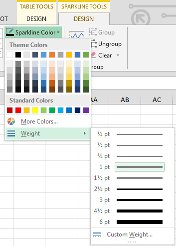
 To change the width of the lines:
1. Click on any cell within the sparkline to show the Sparkline Tools menu.
2. In the Sparkline tools contextual menu, go to Sparkline Color > Weight and change the width of the line as you desire.
10) Create Dynamic Titles In Charts (Use Of Cell References Within Chart Objects)
Have you ever wanted to automatically change the title of a chart based on a reference? For example, let’s say that you have a PivotChart for the monthly sales of a product and you would like the title of the chart to reflect the name of the product that is being plotted.
A regular PivotChart would look like this:
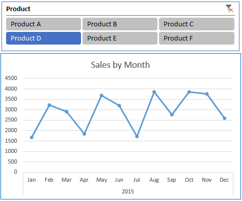
In the PivotChart above, the title of the chart will remain the same regardless of the product selection.
However it would be best if the title changes when the product selection changes in the slicer. For example, if the user selects Product D, then the title of the chart would be: Product D Sales; if the selection is Product C, then the title of the chart would be: Product C Sales.
In order to create the dynamic title, follow these steps:
1. Enter a formula in any cell to create the title. In this specific example, I created a formula in cell G1 to point to the report filter of the PivotTable:
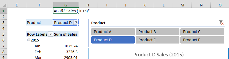
2. Click on the title of the chart.
3. Type ‘= cell where you created the title formula’. For example, if the title is on cell G1 you should type ‘=G1’.
And that’s all! Now every time you change the report filter your chart title will change.
11) Dealing With Empty Cells In Charts And Sparklines [Use NA()]
Have you ever experienced this?
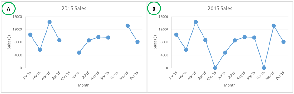
The previous graphs correspond to sales data where unfortunately there was no information available for May’15 and Oct’15.
In scenario A, the cells for May’15 and Oct’15 are empty and Excel shows the graph with empty spaces. In scenario B, I typed zero (0) in the months without data and then Excel shows zero sales.
An alternative approach would be to draw a line connecting the points with information. In order to accomplish this, you can fill the empty cells with NA. To do this just type =NA() in the empty cells. The resulting graph will look like this:
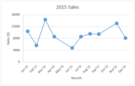
If you have lots of empty cells, rather than going one-by-one, use the Ctrl + Enter trick I showed in tip #4 of this tip. When using this trick, instead of typing ‘=cell above’ you need to type =NA() and press Ctrl + Enter.
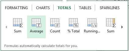
12) Save Time With Quick Analysis
One of the major improvements introduced back in Excel 2013 was the Quick Analysis feature.
This feature allows you to quickly create graphs, sparklines, PivotTables, PivotCharts, and summary functions by just clicking on a button.
When you select data in Excel 2013 or later, you’ll see the Quick Analysis button ![]() in the bottom-right corner of the range selected. If you click on the Quick Analysis button you’ll see the following options:
in the bottom-right corner of the range selected. If you click on the Quick Analysis button you’ll see the following options:
When you click on any of the options, Excel will show a preview of the possible results you could obtain given the data you selected.
Let’s say you’re working with the following data set:
 If you click in the Quick Analysis button and go to charts, you could quickly create the graph below just by clicking a button.
 If you go to Totals, you can quickly insert a row with the average for each column:
 If you click on Sparklines, you can quickly insert Sparklines:
 As you can see, the Quick Analysis feature really allows you to quickly perform different visualizations and analysis with almost no effort.
This is just the tip of the iceberg. Excel has many more features to help you perform data analysis tasks more efficiently. Whether you need to visualize complex data or organize disparate numbers, Excel is the perfect tool to get your data in order.
About the Author: Orlando Mezquita is certified as Microsoft Office Specialist Expert in MS Excel 2003, 2007, and 2010. He owns and maintains the website www.masterdataanalysis.com. In addition, he provides training of business analytics using MS Excel, Minitab, and the R programming language.
Website: www.masterdataanalysis.com
Twitter: @orlandomezquita