


Typical MS Excel spreadsheet data appears in form of a table which consists of multiple columns and rows. Such tables can have millions of data cells, finding any significant meaning in them can be a Sisyphean task. If your daily job requires you to analyze and summarize key business metrics from huge data sets, information overload is inevitable.
How do you work around that? The most effective way is to use Excel Pivot Tables – a summarizing tool that can greatly simplify the process of refining your data and display results in a succinct and clear way.
Often overlooked, Pivot Tables are a powerful tool used to help you recognize patterns in spreadsheet data and extract their significance in the form of a summarized table. Although most people think of them as complicated and time-consuming, they’re actually quite user-friendly. Everything is done by simple drag and drop maneuvers. The best part – no need for complicated formulas.
Besides MS Excel, Pivot Tables can be created in many other spreadsheet applications like LibreOffice and Google Docs. If you’re more comfortable with web-based applications and prefer to perform your data analysis online, make sure to check out our guide on how to work with Pivot Tables in Google Sheets.
Pivot Tables – The Basics
In order to perform complex Excel data analysis, you’ll have to master various Pivot Table functionalities. We’ve already shown you how to create Excel Pivot Tables. Now we’ll show you how to exploit the basic features of Excel Pivot Tables and how to customize them in order to compile meaningful reports.
Pivot Table Design
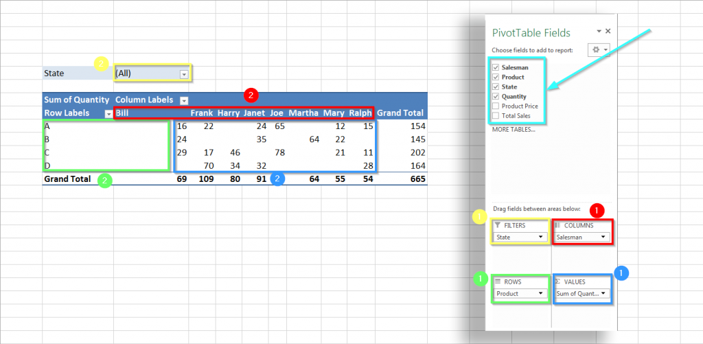
First thing’s first – before we start explaining how to make the most out of Pivot Tables let’s take a moment to get to know their structure. Every Excel Pivot Table has a specific design layout and fields.
Fields are located in the field list, they’re basically all the column headers presented in the table (non-numerical values).
On the other hand, the Pivot Table Layout is determined by four area options:
- Filters – used to apply a filter to an entire table and further refine the results.
- Columns – used to apply a filter to one or more columns in the table.
- Rows – used to apply a filter to one or more rows in the table.
- Values – the most important area that shows the data you are analyzing (mostly numerical values).
Customizing Excel Pivot Tables
Note: We’ve prepared a spreadsheet example (see image) that contains raw, unsorted sales data from a fictional company.
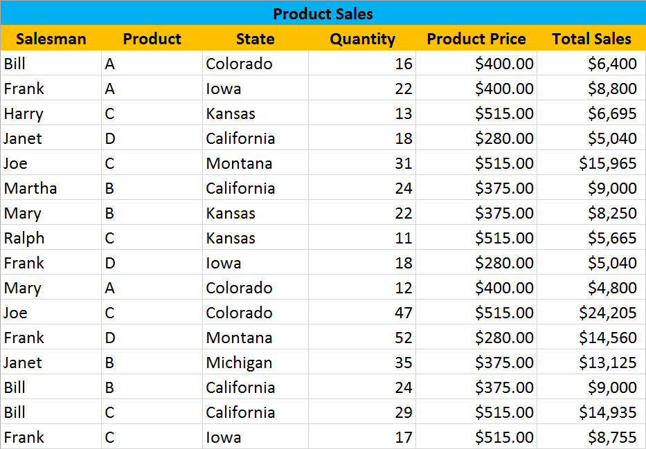
Pivot Tables are ideal when you need to answer a specific question. For our example, let’s say that our manager asked us this question:
“Who is our top performing sales representative?”
How do we find this out?
Rearranging Data
We need to add and rearrange the spreadsheet data in order to find the salesmen that got the highest sales numbers. To accomplish this, we need to add corresponding fields to the appropriate layout areas:
- Product field goes into Row Labels area
- Salesman field goes into Column Labels area
- Total Sales field goes into Values area
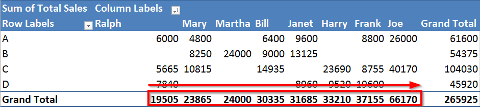
Here’s how the table should look like:
Tip 1: Depending on which field is placed in which area, different outcomes will be obtained. For instance, to show the product quantity that each salesman sold, drag the Quantity field to the Value area.
Tip 2: To show sale values as a % of the total sales instead of amount just right click on a sum value within the Pivot Table and set Show Values As>% of Grand Total.
Sorting Data
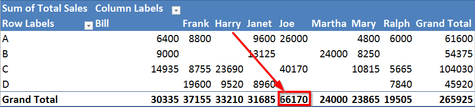
Now, for our example, we went with a small sample and we can clearly see that Joe is the top performing salesman, while Ralph has the lowest scores.
If you’re working with a huge spreadsheet, it won’t be this straightforward. You’ll need to sort it out a bit. This can be done with a few clicks:
- Select one sum value within the Pivot Table
- Right click on it and go Sort>Sort Smallest to Largest or the other way round
Tip 3: If you want to know what data makes up a certain value, you just need to double-click on the desired value cell. A brand new sheet will open containing all the data that forms the specific value.
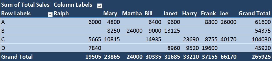
Formatting Table and Data
So what else can we do with our Pivot Table? Well, now that we sorted the data it might be a good idea to change our table appearance. If you don’t like the preloaded design you can choose the one that appeals to you the most:
- Go to Pivot Table Tools>Design
- Click on the arrow to expand the list of PivotTable Styles and select one
On top of that, we are going to format the data in the Pivot Table. After all, it should be clear that the values we’re summing up are $ amounts and not just plain numbers. Here’s how to make the change:
- In the Values box, left click on the Total Sales and select Value Field Settings… the Settings box will appear
- Click the Number Format button, select Currency from the Category list and change the number of decimal places to zero.
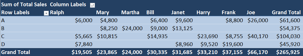
That’s more like it. Now our Excel Pivot Table is concise, well organized, and we can present the findings to our manager.
Filtering Data
Let’s say that our manager was satisfied to learn that Joe is our top salesman. However, he needs more information and asks us an additional question:
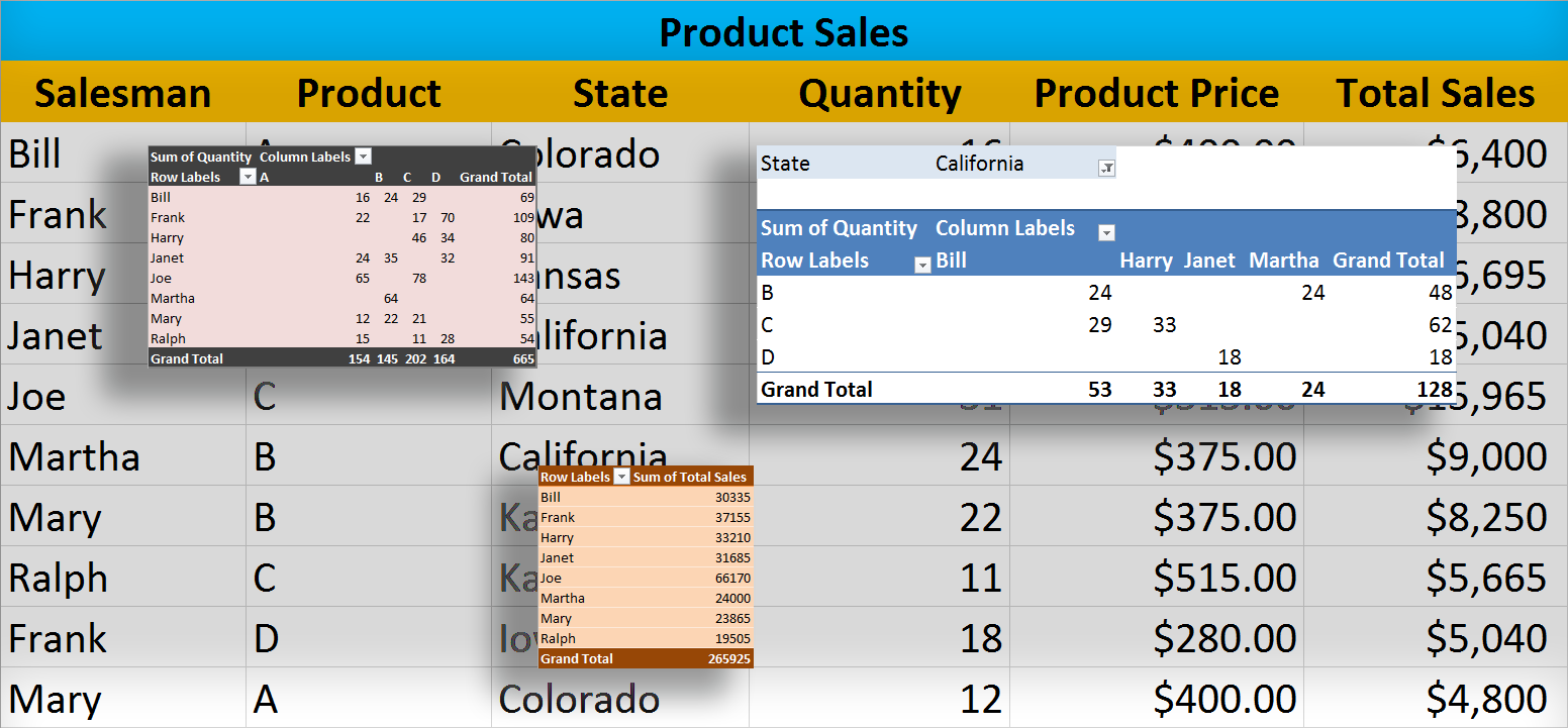
“Which salesman had the most success in Kansas?”
To find this out, we need to fine-tune the result by adding the State field to the Filters area:
- Drag the State field to the Filters area in the Pivot Tables Field Menu
- In the State drop-down menu select Kansas
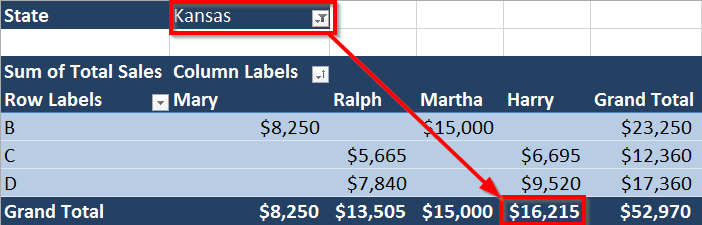
We can conclude that out of four salesmen that sold products in Kansas, Harry was the most successful one. Same rules apply to any other report you need to generate: just apply the appropriate filters to the Pivot Table.
Tip 4: You can filter Pivot Table data manually by clicking on the Row or Column Labels arrow. For instance, if we click on the Column Labels arrow and uncheck Mary and Ralph their values will be excluded from the table.
Pivot Charts & Slicers
Next, let’s say our manager informs us that he is exhausted of looking at all these numbers and tables every single day and asks us to answer him this:
“Is there a way to graphically represent the best performing salesman in the state of California?”
Of course, there is. It’s always a good idea to turn those dull, countless rows and columns of numbers into an attention-grabbing visual report. A Pivot Chart allows us to do exactly that.
Actually, it’s quite easy to enhance your report with a Pivot Chart, here’s how:
- Click on the Analyze Tab located in the top toolbar
- Click on the PivotChart button and specify the type of the chart you want to insert
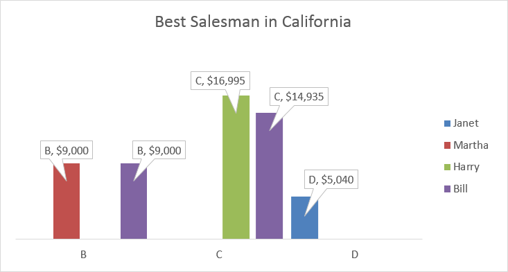
Obviously, Bill is the best performing salesman in the state of California with the combined sales amount of $23,935.
Tip 5: Compile eye-catching reports in order to convey information to your superior or a potential customer in a more fun and colorful way.
If we want to go that extra mile and dazzle our superiors, we can use a Slicer and add a note of interactivity to our report. Slicers basically provide us with buttons that allow us to filter Pivot Table data. In addition to filtering, slicers also help us understand exactly what we’re seeing in a filtered Pivot Table or Chart.
Here’s how to Add a Slicer :
- Navigate to the Analyze Tab and click on the Insert Slicer
- In the Insert Slicer dialog box, checkbox the fields you want to analyze
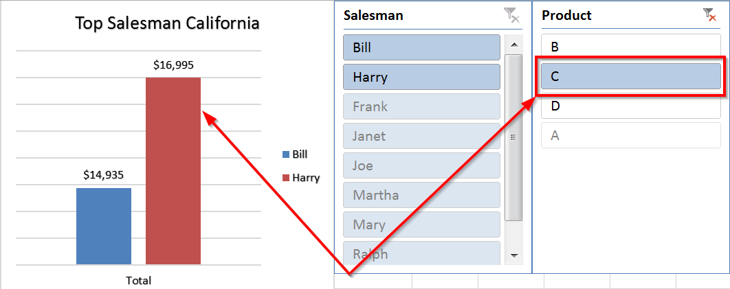
Although Bill was the best performing salesman in California, it was Harry who generated the highest income when it comes to the sale of product C.
Tip 6: If the plain Slicer is not a good fit for your report, go to Slicer>Options>Slicer Styles and select the style you prefer.
Conclusion
These are only some of the basic things you can do to start working with Pivot Tables in Microsoft Excel. There are far too many to list and we can go on for days about each of them. Depending on your needs, this guide might be all you need. Nevertheless, if you want to explore the full potential of Pivot Tables, you might want to get a book that specializes in the subject.
Are you using Pivot Tables to build your business reports? Feel free to share your favorite Pivot Table feature in the comment section below.
Also, if you’d like to read articles like this on a weekly basis make sure to bookmark our page and follow our social media profiles on Facebook, Twitter, Google+. New post every Monday!