


In this day and age of big data and information overload, data visualizations are, hands down, the most effective way of filtering out and presenting complex data.
A single data visualization graphic can be priceless. It can save you hours of research. They’re easy to read, interpret, and, if based on the right sources, accurate, as well. And with the highly social nature of the web, the data can be lighthearted, fun and presented in so many different ways.
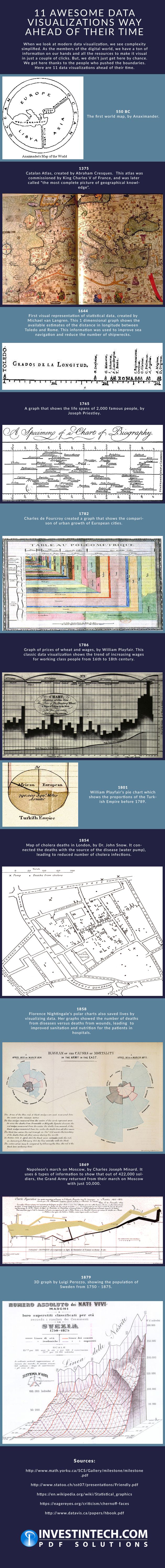
What’s most striking about data visualizations though is that they aren’t as modern a concept as we tend to think they are.
In fact, they go back to more than 2,500 years—before computers and tools for easy visual representation of data even existed.
Curious to see how data visualizations developed over time?
Below is an infographic that highlights 11 unique data visualizations from across different—yet significant, periods in history. It includes the first world map created by Anaximander, the elaborate Catalan atlas commissioned by King Charles V of France, Dr. John Snow’s map of cholera deaths in London that helped in combating the disease in the second half of the 19th century, and so on.
From ancient Greece and Medieval France to Victorian England and 19th century Sweden, these data visualizations and creators were ahead of the times, innovating the way in which information could be presented.
Whether they knew it or not at the time, these creators helped to develop an essential modern-day tool that is now invaluable to the world of statistics. Take a look.
Embed this infographic on your website:
Embed this infographic on your website: